INSUBCONTINENT EXCLUSIVE:
Brian Ascher
Contributor
Share on Twitter
Brian Ascher is a partner at Venrock, where he
invests broadly across enterprise and fintech and serves on the boards of several companies, including Personal Capital, 6Sense, Socrates
AI, Dynamic Signal, Retail Solutions, SmartBiz Loans, and Inrix.
More posts by this contributor
Running through walls: 6Sense
Amanda Kahlow on values that stick
Running Through Walls: Dynamic Signal Russ Fradin on how good businesses constantly
pivot
Once you&ve found product/market fit, scaling a SaaS business is all about honing go-to-market efficiency.
Many extremely
helpful metrics and analytics have been developed to provide instrumentation for this journey: LTV (lifetime value of a customer), CAC
(customer acquisition cost), Magic Numberand SaaS Quick Ratio are all very valuable tools
But the challenge in using derived metrics such as these is that there are often many assumptions, simplifications and sampling choices that
need to go into these calculations, thus leaving the door open to skewed results.
For example, when your company has only been selling for a
year or two, it is extremely hard to know your true lifetime customer value
For starters, how do you know the right length of a &lifetime?&
Taking one divided by your annual dollar churn rate is quite imperfect,
especially if all or most of your customers have not yet reached their first renewal decision
How much account expansion is reasonable to assume if you only have limited evidence?
LTV is most helpful if based on gross margin, not
revenue, but gross margins are often skewed initially
When there are only a few customers to service, cost of goods sold (COGS) can appear artificially low because the true costs to serve have
not yet been tracked as distinct cost centers as most of your team members wear multiple hats and pitch in ad hoc.
Likewise, metrics derived
from sales and marketing costs, such as CAC and Magic Number, can also require many subjective assumptions
When it just founders selling, how much of their time and overhead do you put into sales costs? Did you include all sales-related travel,
event marketing and PR costs? I can&t tell you the number of times entrepreneurs have touted having a near-zero CAC when they are just
starting out and have only handfuls of customers — which were mostly sold by the founder or are &friendly& relationships.
Even if you
think you have nearly zero CAC today, you should expect dramatically rising sales costs once professional sellers, marketers, managers, and
programs are put in place as you scale.
One alternative to using derived metrics is to examine raw data, which is less prone to assumptions
The problem is how to do this efficiently and without losing the forest for the trees
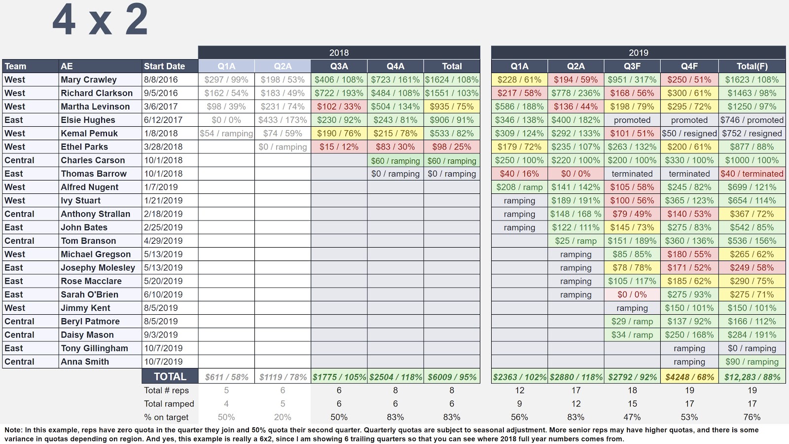
The best tool I have encountered for measuring sales efficiency is called the 4×2 (that &four by two&) which I credit to Steve Walske, one
of the master strategists of software sales, and the former CEO of PTC, a company renowned for its sales effectiveness and sales culture
[Here a podcast I did with Steve on How to Build a Sales Team.]
The 4×2 is a color-coded chart where each row is an individual seller on
your team and the columns are their quarterly performance shown as dollars sold
[See a 4×2 chart example below].
Sales are usually measured as net new ARR, which includes new accounts and existing account expansions net
of contraction, but you can also use new TCV (total contract value), depending on which number your team most focuses
In addition to sales dollars, the percentage of quarterly quota attainment is shown
The name 4×2 comes from the time frame shown: trailing four quarters, the current quarter, and the next quarter.
Color-coding the cells
turns this tool from a dense table of numbers into a powerful data visualization
Thresholds for the heatmap can be determined according to your own needs and culture
For example, green can be 80% of quota attainment or above, yellow can be 60% to 79% of quota, and red can be anything below 60%.
Examining
individual seller performance in every board meeting or deck is a terrific way to quickly answer many important questions, especially early
on as you try to figure out your true position on the Sales Learning Curve
Publishing such leaderboards for your Board to see also tends to motivate your sales people, who are usually highly competitive and
appreciate public recognition for a job well done, and likewise loathe to fall short of their targets in a public setting.
A sample 4×2
chart.
Some questions the 4×2 can answer:
Overall performance and quota targets
How are you doing against your sales plan? Lots of red is
obviously bad, while lots of green is good
But all green may mean that quotas are being set too low
Raising quotas even by a small increment for each seller quickly compounds to yield big difference as you scale, so having evidence to help
you adjust your targets can be powerful
A reasonable assumption would be annual quota for a given rep set at 4 to 5 times their on-target earnings potential.